Now we have the data all flowing through Azure, we can display the live and historical temperature data coming from the MXChip on a Power BI dashboard. First we will display the live data online.
-
Go to the Power BI Website and sign in using the account you authorised earlier with the Stream Analytics output.
-
On the navigation menu on the left, Click on My Workspace then in the main window click on Datasets.
You should see the Output you created from Stream Analytics listed in your available Datasets. It can take a few minutes to come through, so if it’s not there, wait a few more minutes and refresh the page.
-
When the Dataset shows, in the top right of the window click + Create and choose Dashboard. Type in a name for your dashboard and click Create.
-
When the dashboard has created, click the Add tile button from the menu at the top of the screen. In the Select Source window select Custom Streaming Data and click Next.
-
Choose your Dataset from the list and click Next.
-
In the Visualization Type drop down, choose Line Chart. Add an Axis with the value EventProcessedUtcTime. In the Values drop down, choose Temperature and Humidity. In the Time Window to Display field, choose 1 minute. Click Next, give your chart a title and click Apply.
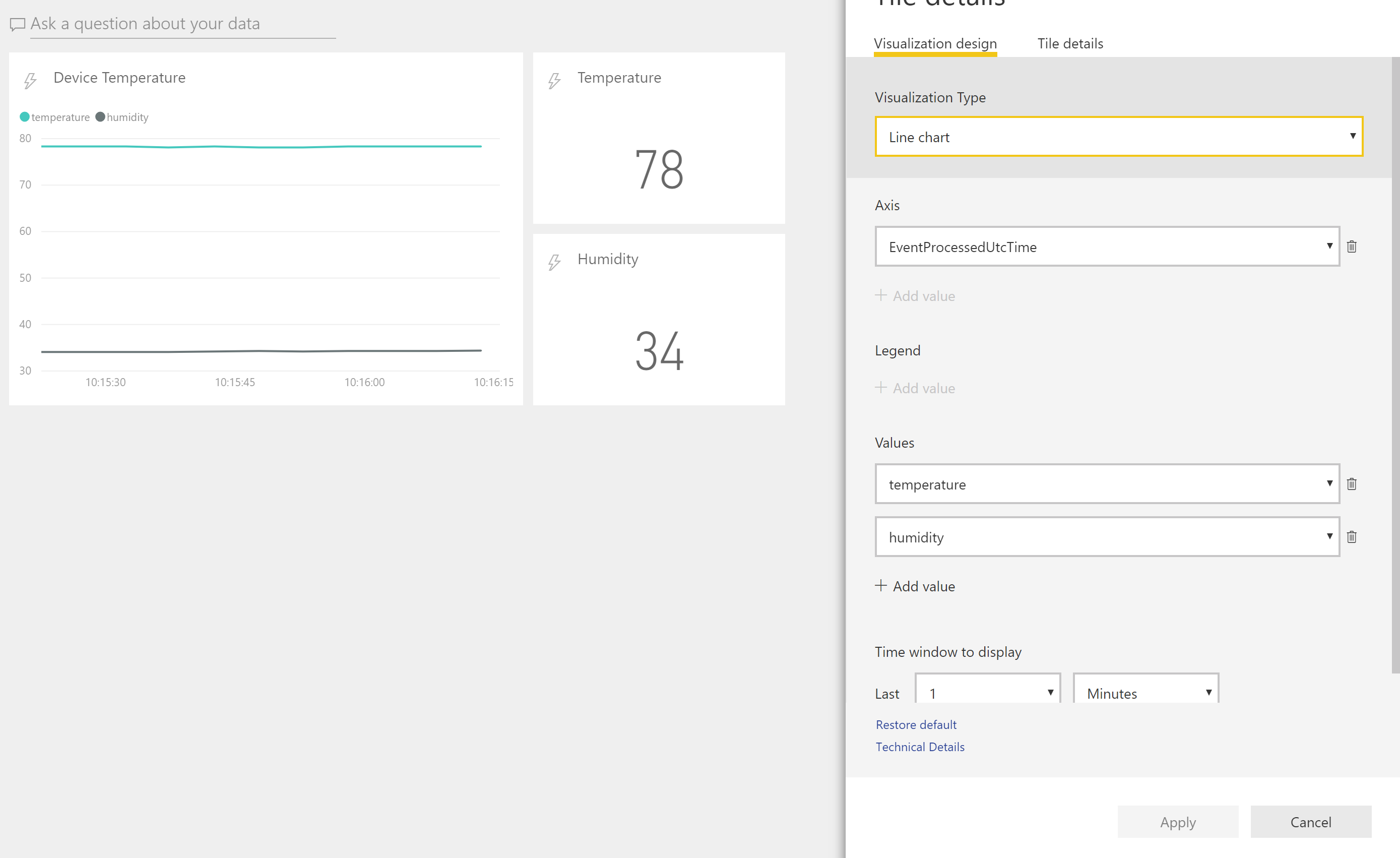
-
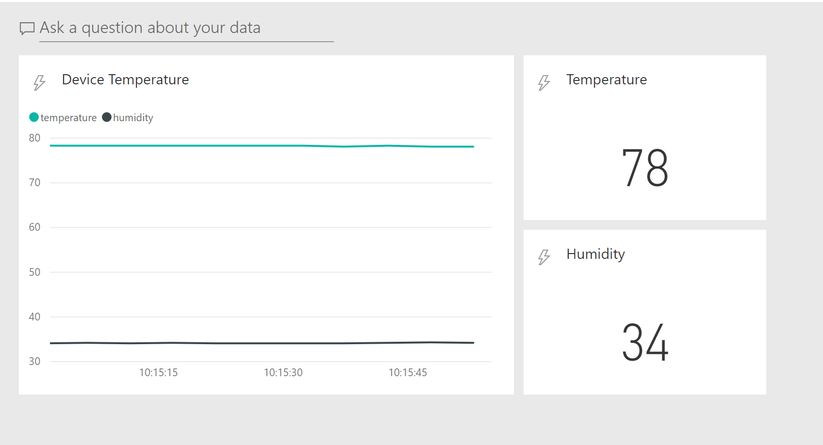
Add another tile but this time use a card, select Temperature and continue as before. You may also do the same for Humidity until your dashboard looks like below.
-
Now we will use the Power BI Desktop application for the second dashboard, go to the Power BI Download page and click Advanced Download Options. Download and install the Power BI Desktop application choosing PBIDesktop_x64.msi when prompted for which file to download.
Once installed it will ask for you to sign in, use the same account you used for the online version of Power BI.
-
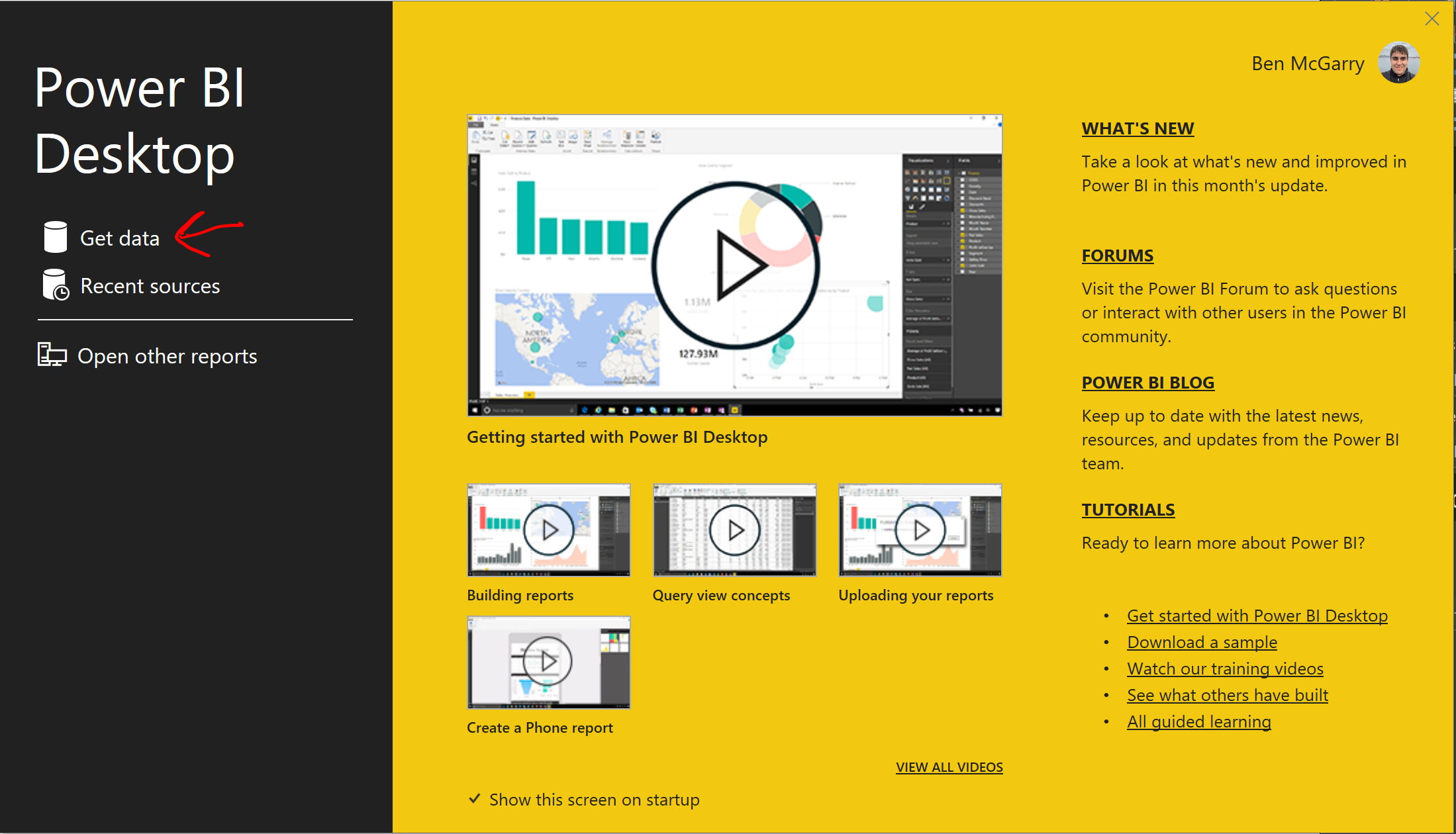
On the splash screen, click Get Data.
-
Click Azure, then choose Azure SQL Database. Click Connect.
You will need your SQL server name. Go back to the Azure Portal and click on SQL Databases in the left-hand blade. It will display your SQL Database, Click on it to open the SQL Database blade and it will contain the name of your SQL server as seen below. Copy the name to the clipboard and paste it into Power BI.
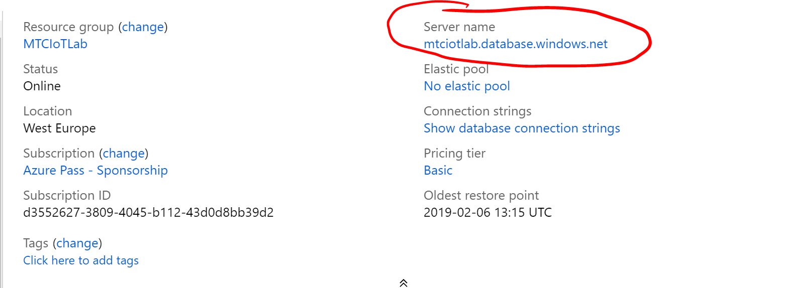
You can leave the Database name as blank then click Ok.
-
You will be asked for the credentials to your database. Ensure you click on the Database tab on the left and enter them in the two boxes, do not enter them on the Windows tab as they will not work!
You can either import the data as static data (Import) for your report, or connect the SQL database as a DirectQuery, which means you will be able to refresh the data in the report. Choose either.
-
The Navigator should display your SQL server and database. Click on the database to display the tables. You should see your table, called Table, listed. Tick the box beside Table, a sample of the data will display. Click Load. You may see an Apply buttonn appear at the top, if so click the button.
The data is now loaded and ready for you to display in a chart. You can drag fields around in the designer and drop them into the relevant place. Give it a go, it’s easy to manipulate.
-
To draw a line chart plotting history humidity and temperature data over time, choose Line Chart, the first bot in the second row down under visulisations.
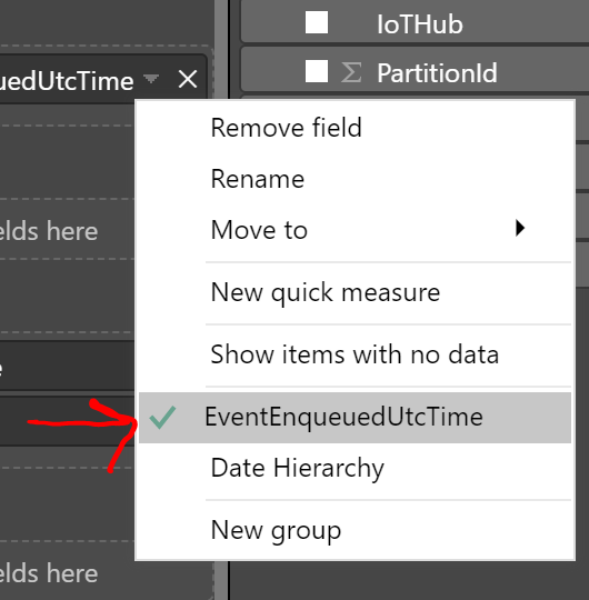
On the Field menu on the right, click EventEnqueuedUtcTime and it should put this into the Axis box. Click the tiny down arrow beside the field name and click the option above Date Hierarchy to remove the Day/Year/Month breakdown (if it is present).
-
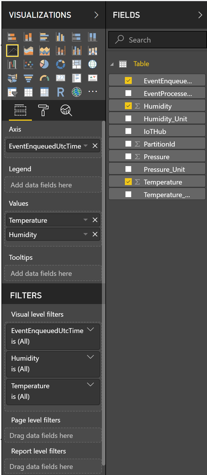
In the Field area, tick Humidity and Temperature. They should then appear on the line graph.
You should end up with a chart design that looks like this:
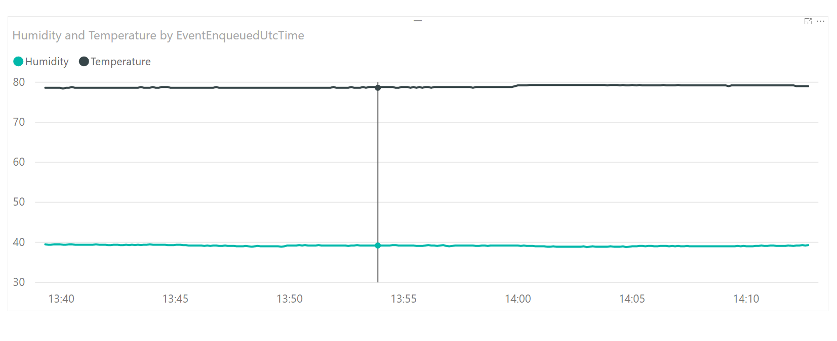
This will display a line chart that looks like this:
You can drag the chart around to make it larger.
In order to pull the latest data from SQL, click the Refresh button on the task bar at the top. Breathe on the sensor a couple of times, then refresh the data. You will see the lines on the chart move around from the updates coming from SQL.
If you signed in to Power BI Desktop with the same account as PowerBI.com, you can publish this dashboard to your online workspace and share it. Click the Publish button to do that and specify My Workspace.
Once you’ve published it in PowerBI.com, you can create a historical data report and pin it to the live streaming dashboard to get a combination of the two. Have a play around and see what you can create.
I hope you enjoyed the lab! If you have any further questions please ask the lab instructors.